
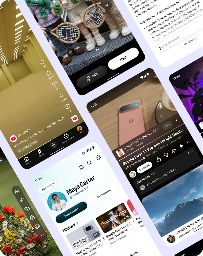
Instead of a confusing redesign, the platform is quietly making small changes to give creators the spotlight they deserve.
YouTube just gave us a fresh peek behind the curtain at how their design team works, and the core message is clear: make way for the creators.
In an update shared on August 13, 2026, by Jonathan Terleski, YouTube’s VP of User Experience, the company laid out five design philosophies guiding how the platform looks, feels, and functions. Rather than dropping a single, jarring redesign on a specific launch date, YouTube has been steadily rolling out these interface changes incrementally since late 2025.
YouTube is tidying up its app by removing screen clutter, fixing annoying buttons, and making it way easier to focus on actual videos.
If you’ve noticed the mobile app feeling cleaner or video controls feeling less intrusive over the past few months, these five rules are the reason why.
The 5 Core Principles
From cleaner screens to faster video uploads, here is a look at the simple design rules making the app easier to use.
It all starts with making content the star. The interface needs to wrap around the video, not fight it for attention. To keep viewers focused on the work itself, YouTube is stripping away screen clutter—like moving product overlays off the video frame and placing them neatly on a dedicated shelf below the player.

Alongside that, the team is prioritizing relevance ruthlessly. Unused buttons and crowded menus are getting tucked away based on real viewer habits. On Shorts, that translates to condensed video titles, fewer side icons, and far more dedicated screen space for the actual clip.

Simplicity is another major pillar. Fewer clicks lead to better experiences, so the team is systematically cutting down redundant steps across the app. This is especially true in the Shorts creation flow, making it faster to film, edit, and post on the fly.

To keep things intuitive, YouTube aims to be a good neighbor by prioritizing overall app consistency over novelty. Rather than re-inventing the wheel for every new tool, they rely on uniform typography, familiar iconography, and recognizable layouts. They’ve even updated watch-page ad layouts so promotions no longer displace or push down video titles.
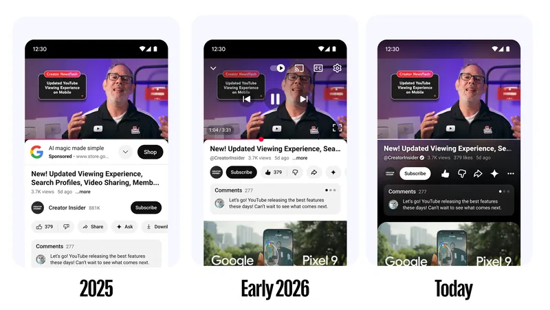
Finally, they build for the ecosystem. YouTube lives on everything from a 6-inch phone to a 75-inch living room TV, so design elements are standardizing across devices. Hopping from mobile scrolling to big-screen viewing should feel completely natural.
Why We Like It
Interface updates can easily feel like unnecessary change for the sake of change, but this direction genuinely hits the mark. Moving pop-ups, shop links, and heavy icons off the video player removes constant visual friction, giving full visual real estate back to the media you actually came to see.
Crucially, phasing these updates gradually shows respect for user “muscle memory”—the app improves without breaking daily habits or forcing anyone to relearn basic navigation overnight. For creators, streamlining the upload flow cuts out tech headache and lets people ship quick edits without jumping through redundant software menus. At its core, giving video pixels priority over UI banners proves a true creator-first mindset, placing the artist’s work right where it belongs: front and center.